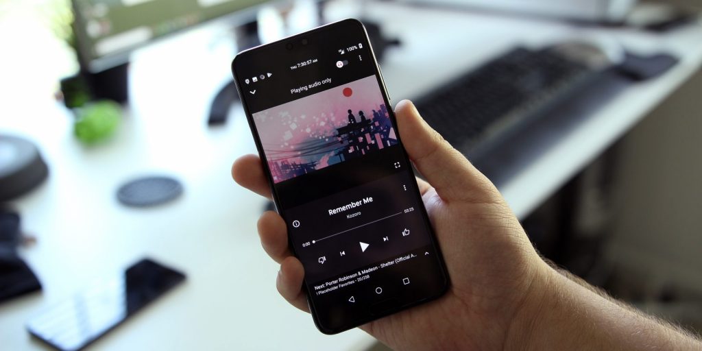
Google has just updated its YouTube with some fresh features like queue and a completely revamped music player design. Earlier there were reports which claim that Google may kill the Play Music service and instead of that an alternative will be introduced. That alternative was rumored to be called as YouTube Remix but for now, no details are there about it. Some users have reported the redesign of player which might be the first step from Google.

As suggested by XDA thread, a user named c2fifield on Reddit has reported about the YouTube Music redesign by sharing some images of it. What so ever there is no noticeable change in the YouTube Music’s homepage having 3 tabs for Home, Trending, and Library. Although some helpful features are also introduced, identical to the Google Play Music, YouTube Music allows one to place the tracks in order to custom playback techniques.
In the new interface introduced Music Player offers full screen which results in better understanding of media controls. As visible in the images, buttons for back, stop and play are easy and anyone can understand. The thumbs up and down has been shifted to the center, and other options that center are aligned buttons now appear to be bigger in size. Google slightly is making changes in Google Music which are enough to know that they might be bringing an all-new app or Google will roll out a better version of the existing engine.
