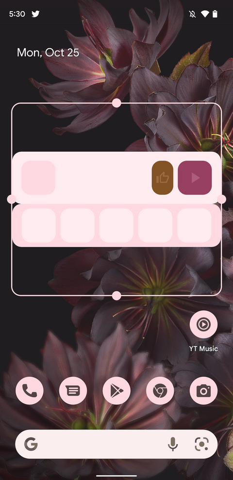
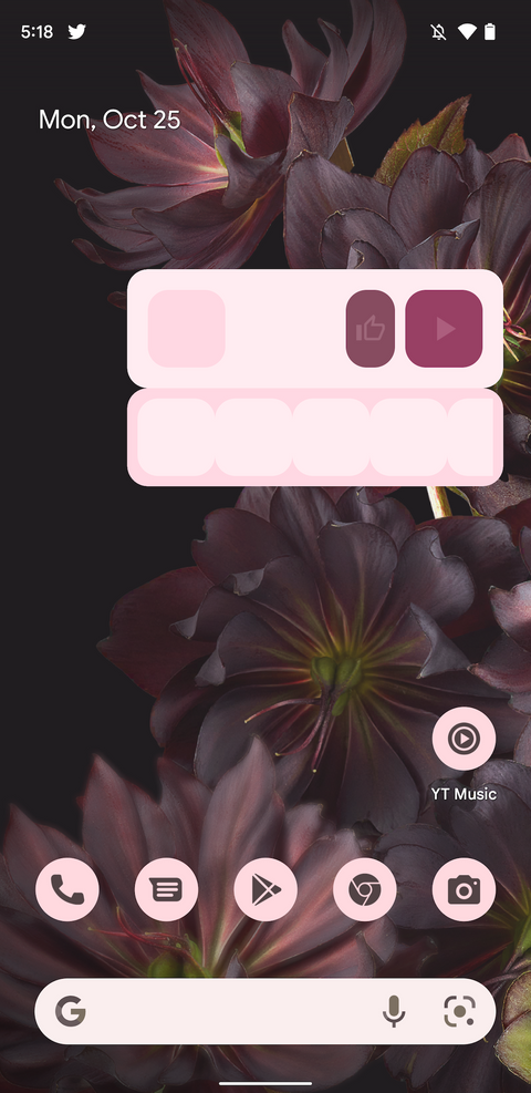
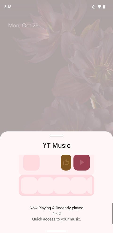
Google has updated almost all of its app with Material You design language. Now the company is shifting its focus to the widget section. This time, there are two new Material You inspired YouTube Music widgets— Now Playing and Recently played.
Make sure to visit: [Update] Download Realme Soloop Video Editor v1.41.3 [Old Versions Archived]
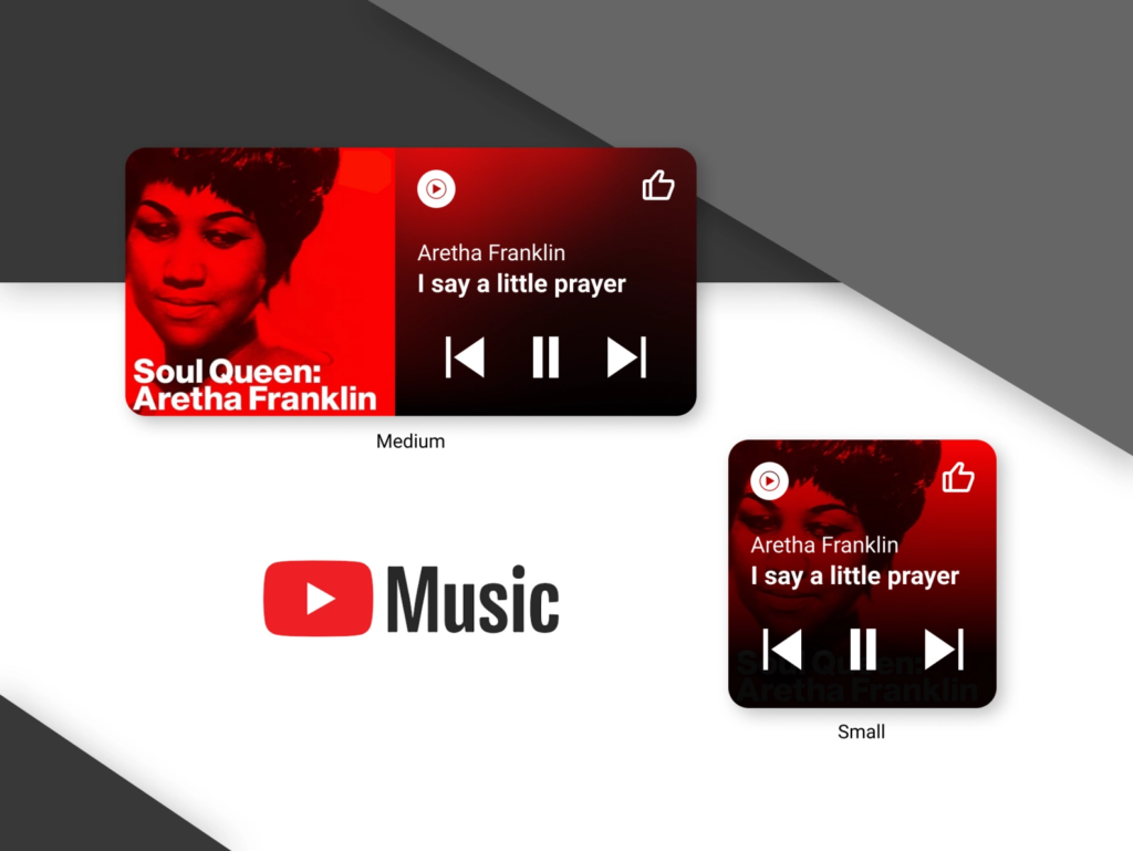
FYI, the new theme was already available on iOS. On the day when Android 12 was released, Google previewed the widgets on the official Twitter account of YouTube Music. And now it is finally enabled.
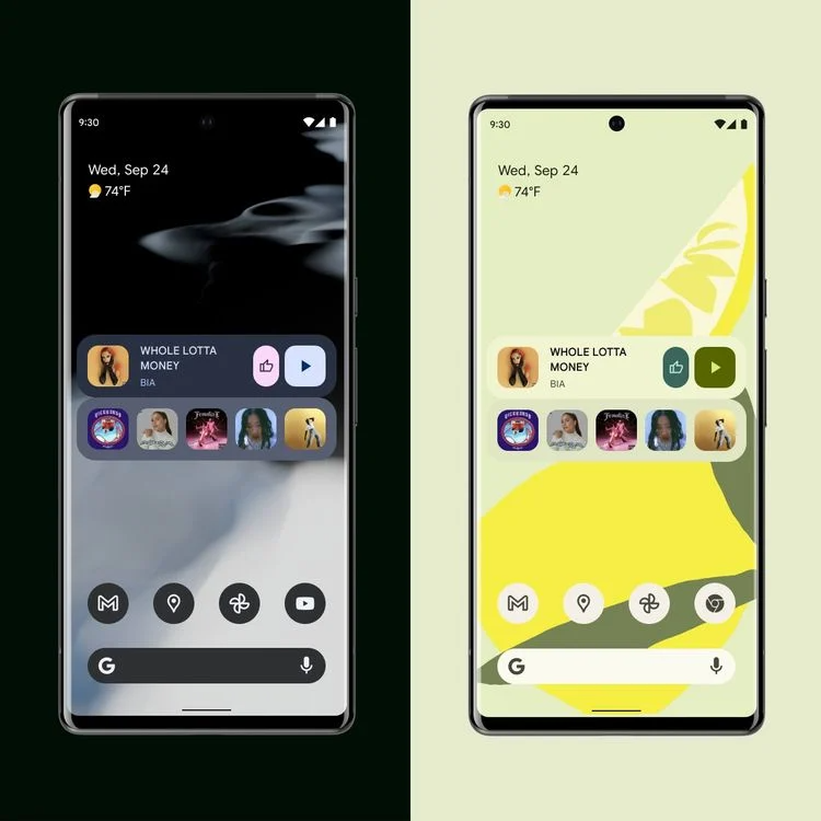
Now Playing and Recently played widgets use a 4×2 grid by default. But you can expand it width-wise and get a larger grid size. Though the content displayed will be the same in both sizes. At the top of the widget, you can see the currently playing song followed by the like and play/pause buttons. Under these controls, you can see and dplay your recently played tracks directly from your home screen.
Now that we have access to easy controls and recent songs, we hope to see more media controls shortly. Also, we are not sure when these widgets will release for everyone, but it could be anytime soon.

