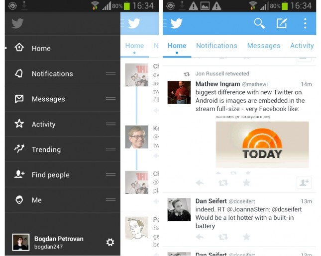
Twitter recently rolled out the beta mode of the 5th version of the Twitter for Android Application. Well the update has many changes to be seen with starting with welcome screens to the newer version of Android.


The basic design changes are not much big but mean alot when reading about the Application guidelines decided by Matias Duarte and his team of UX wizards.
The biggest change is the replacement of the 4 section menu at the top of the Application. While it is expected to be better than the previous. Also we have a sidebar in the twitter app when we tap on the twitter logo on the top right. The sidebar menu hosted the 4 sections which were replaced from the top of the Application. While in addition to these 4 menus we have 3 more additional menus.
While the applications’s 4 menu sections added in the responsive side bar of the app are replaceable and ready to shifted and arranged according to our needs.