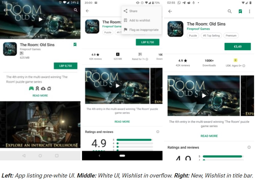
Google always make changes in the Interface of the Google Play Store to facilitate users with the most interesting tweaks. Most of the changes are done from the server end, users need not update the app. Recently, we have seen that Google is testing simultaneous downloads and some other useful features. Today we’re going to talk about a minor change that most people won’t be bothered about – a more reachable wishlist button.
If you remember, the wishlist icon was kept near the title bar, before the introduction of the all-white theme in the Google Play Store. Thus, it was very easy to save apps for later, Later, Google moved the wishlist icon from the main page and shifted to the overflow menu on the top.

Now, Google introduced a new minor change where the Wishlist Icon is moved back to the app listings page. Now it is positioned in the title bar, in between the search icon and the overflow menu.
Read More: Google Play Store updated to v9.1.24 with bug fixes and improvements
So, Do you use the Wishlist feature? Share your views via comments below.
