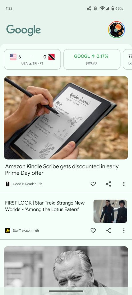
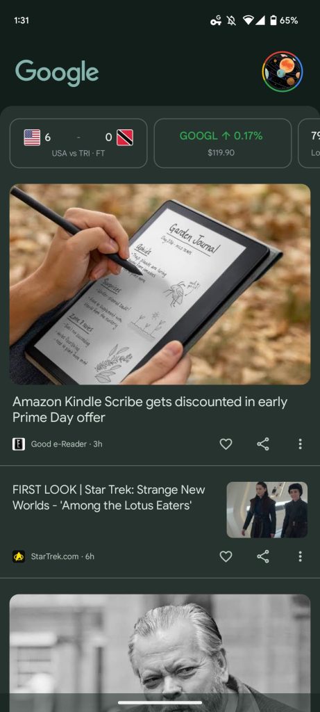
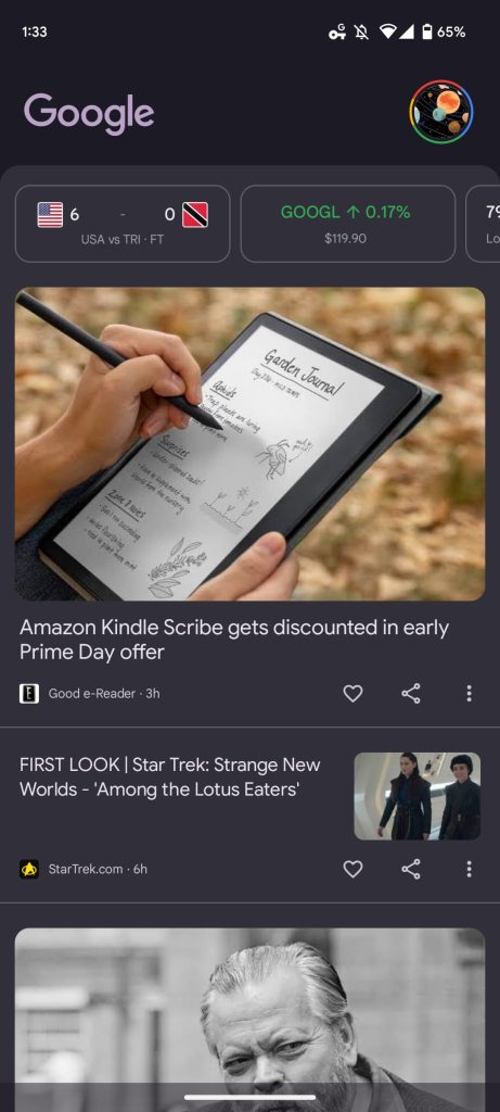
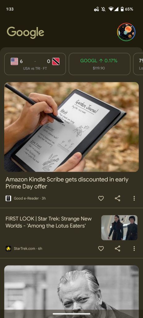
Google is adding some new Dynamic Colors to the Discover feed on the Pixel Launchers. Prior to this most recent modification, just the top section of the Google logo used Dynamic Color theming. The Pixel Launcher’s Discover Feed on Google App v14.26, the most recent beta release, features extended usage of Dynamic Color, although it hasn’t yet been extensively implemented.
When moving from your home screen to the feed, this burst of color is kind of wonderful. The feed backdrop is currently being added to it. You’ll now notice something that better matches your background, rather than being white or grey. However, the top carousel of widgets and the readability of article pictures and headlines are unaffected.


MAKE SURE TO READ: Google upgrades the Android logo with a 3D model and a new wordmark
In addition, even after all these months, the (short) Material You bottom bar of the Google App has not yet been made available to everyone on phones. On tablets, the M3 navigation rail is available, however, it only uses a blue accent because Dynamic Color isn’t currently supported.
