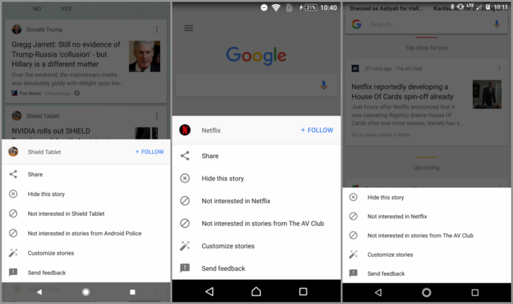
Google is now testing a new layout for overflow menu on its Google App for Android. To be precise, it’s another server-side test similar to that Google has done many times before. Apparently, the new test brings a design change in the overflow menu of Google feeds. And, the roll-out is now being more wider it seems.


So far, whenever we tap the three-dot menu on a story in the Google feed will open a popup with options inside. However, with the new implementation it’s now a window of sorts that slides up from the bottom. In fact, the new layout seems to be fresh, clean and pleasing compared to the previous gloomy pop-up. For comparison, screenshots of previous design and the new window layout is provided below.
By the way, as we’ve already mentioned that the design change is a server-side test. It’s not necessary that your Google app has undergone the design change. But, as it’s now rolling-out to more users worldwide, soon you’ll be too seeing the changes, hopefully.
In addition, it’d be wise to update the Google App to latest version in order to access any new feature or UI changes. So, you may update the app from Google Play Store secure and safe.
Google App: Play Store