Apple released its new version of the iOS namely the iOS 7. There are many new features that have been added into it, and the looks and transitions have been transformed. But one thing I would like to say that, now the iOS with this release has come more close to Android OS in looks. The company just “inspired” from Android, is what all the online geeks are saying at the point of time. So lets have a look at some of the new features in the latest iOS, and compare them with Android, i.e iOS 7 vs Android Jelly bean basic gestures.
Notification Panel:
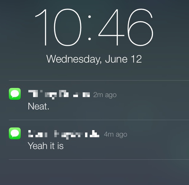
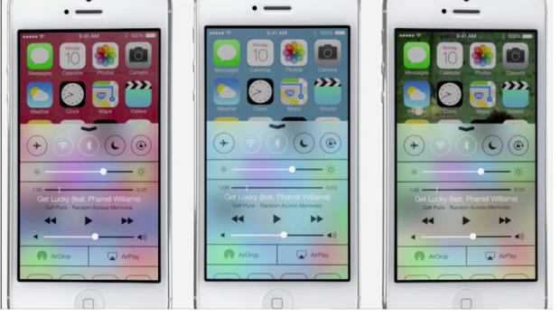
The notification bar on the both of the platforms, the Android and the iOS are pretty much same, you need to swipe from top to down. Android having a black background (which can be tweaked to any color or can be made transparent) with expanded notifications, but on iOS 7 you have translucent background and the top bar does not change when you enter the notifications panel, while it does change on the Andriod. The notifications in the iOS appear as a continuous stream with small icons and relevant text regarding the basic feed for the type of notifications.
Multitasking:
Multitasking again the company seems to have been innovating from the Android versions, the scrollable list of active applications and the swipe to close has been made available in the iOS 7. Which is an Android Gesture, and really some people really consider it copying from Android style, and the company seems to have lost it’s innovation improvisation. They could have, rather should have come up with something more innovative and something out of the box, for which the company is known for.
Lock Screen:
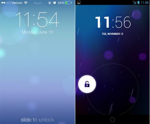
Again the lock screens are almost same (I’m Kidding actually on Android You can Change it to whatever way you want but not on iOS), offering the homepage wallpaper, and the same gestures like camera and similar. Also you could edit some the gestures for swipe to open camera, messages etc right away from the homescreen itself. The functionality and the performance of both the lock screen is almost same, but the point is that the Android already had these features from some time now, so one can again say that Apple innovated from Android.
Apple Maps vs Google Maps:
Apple had a really hard time when they didn’t allowed the third party Google maps app in their OS marketplace, and really faced a lot of criticism as they really tried to push Apple Maps. However they later allowed the Google Maps in Apple Store which turned to the top spot in just 9 hours. Now things are changing slowly, again we see amazing 3D effects and transitions in the map gestures. Many features like finding places of interest, share your location with your friends. The company did not demonstrate the better and more and more expanding maps along with accuracy. Certainly the Apple Maps are not yet that accurate and efficient as the Google Maps. So again company loses out in the maps battle.
Verdict:
So, yes the flying news that Apple had drawn innovation from Android is partly true (smally small). The notification bar, the Multitasking gestures and the Lock Screen are the definite evidences to that statement. But still the iOS has also some more gestures that are new, not being literally copied from any other OS. However the new update may bring out more user satisfaction as it is really getting more and more user friendly.


