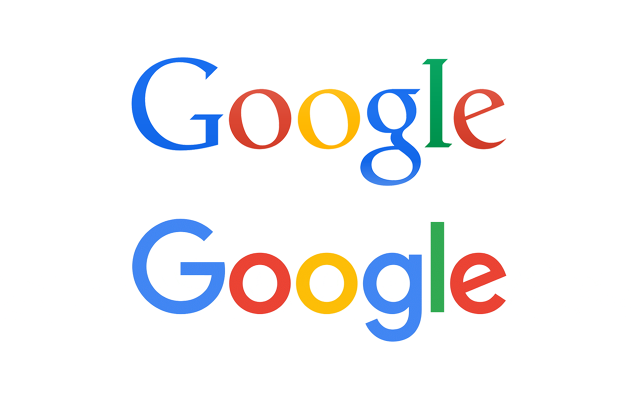
Google has changed its logo design from the one which was little thin but now they have introduced a new logo which comes with Boldness. It seems like Google have increased the weight of font.
The company which is creating Operating Systems for every smart device, from watches, smartphones, tablets to cars. Google changed its logo and its time for Google to rebrand all the stuff they have been working on and have already introduced
Here’s what Google is saying:
Today we’re introducing a new logo and identity family that reflects this reality and shows you when the Google magic is working for you, even on the tiniest screens. As you’ll see, we’ve taken the Google logo and branding, which were originally built for a single desktop browser page, and updated them for a world of seamless computing across an endless number of devices and different kinds of inputs (such as tap, type and talk).
It doesn’t simply tell you that you’re using Google, but also shows you how Google is working for you. For example, new elements like a colorful Google mic help you identify and interact with Google whether you’re talking, tapping or typing. Meanwhile, we’re bidding adieu to the little blue “g” icon and replacing it with a four-color “G” that matches the logo..
The new design keeps Google’s primary color theme but switches to a sans-serif typeface. According to Fast Company, the new font is Google’s own creation, called “Product Sans.” We first got a glimpse of it in the Alphabet logo.
So do you guys like it? Share your views via comments below.


