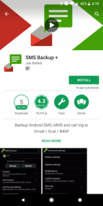
Google always keep changing itself, its products and their designs. This time also, Google is here with a redesign of the Google Play Store on Android devices. Google has started the rollout of the redesign but it is currently limited to a few users. Unlike, the colorful and bold color combinations, Google is testing some elements with grey color and also bringing big install buttons.

It appears that the top bar green color is replaced by a white color. Also, we can see the green changelog color to the white making it really colorless. Also, we can see a grey color background in the review section of any App in the Google Play Store.
There are many other major changes that have stuck with the new Google Play Store update. Google has adjusted the padding and margin of the test columns and has made wider space for reviews, and there’s a little change in the font style. The new update is also reflecting the pullout of round elements from the Play Store. Now, we can see round indicators in the categories, a number of installs and review card is not available.
Update: The Google Play Store update is now rolling back for some users, but for, some it is still present.


