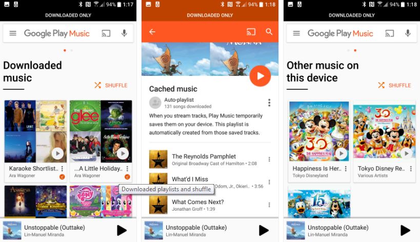
Google has been rolling out new version of its Play Music App. The latest app brings User Interface Changes to the App. The main and the most important one is the Listen Now Menu or Home Menu. Earlier, it was mixture of Recent and Recommendations. Now, they have made changes to the listen now, they have made it purely recommendations, with only a Recents button in the top right corner.
 The above changes have made the Home menu much more useful than before. They have shifted to more Black and White color than the base orange color. There are many other changes in the app which you can surf by updating the App.
There are many features that Google Play Music Caters beside simple playing and organising. But all those features are available only on the downloaded albums.
Google Play Music is most used App on the Android Ecosystem. Any change to this app affects many users. THis time they have made few UI changes but they were quite needed ones.
