Earlier this year, Google revealed its Android 12 based Material You at the Keynote I/O 2021 event. so far, several apps have adopted the new design while others are under way. Google specifically has update Gboard, Messages, Chrome, and more apps in the past few months. Now, for the first time, the company is updating the time picker UI with the Material You theme in its Android apps.
Make sure to visit: Get official Google Pixel 6 and Pixel 6 Pro wallpapers for free!
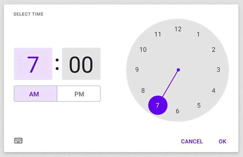
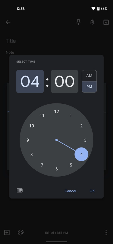
As Material You is all based on personalization, the new time picker UI is also more user and touch-friendly. Once updated, the spacing for setting time i.e; hours, minutes and AM/PM tabs are improved, making it more convenient to manage.
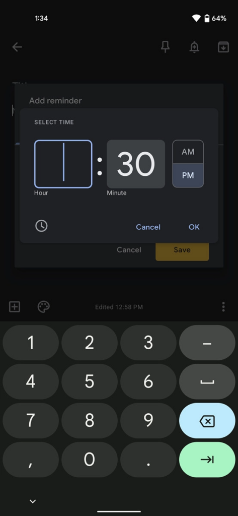
While adjusting time via the keyboard, the refreshed user interface uses the maximum available space. The time field now takes a major part of the room rather than the “Set time” header. So is the case with AM/PM buttons. Unlike before, these are more distinguishable.
The redesigned time picker UI is unfurling to several Google apps. You can notice the change while setting Assistant Reminders in Google Search. Additionally, Google Keep version 5.21.301.10 is also adopting this new theme. Though the major apps like Google Clock, Task, Calendar, Weather, and more are yet to grab the overhaul.


