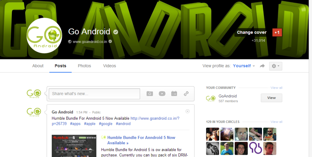
Google has updated its couple of years old Social Network, Google+. New update brings several new improvements in web User Interface. They have added an option to embed large cover images exactly 2120 pixels by 1192 pixels at a 16:9 ratio. Google also outed ‘card’ layout for About section in Profile with addition of new Reviews Tab.
Without any official announcement or blog writing, Google has rolled out UI update to Google+ profiles. New features are available for both personal, and business pages and profiles. First coming onto
Large Cover Photos: Google+ now allows users to add much bigger cover photos — up to 2120 by 1192 pixels and displayed in 16:9 format.
Card Layout: While viewing your About tab in Profile you have or will notice that Google has also added ‘card’ like layout for displaying information about us or pages. Layout is similar to Google Now UI which is present on smartphones and tablets.
Local Reviews: In order to add some local flavor Google has now added Local Reviews tab. Its a move in line with Google’s efforts to expand local search across its platforms. Its also designed using the new tiled theme.
Google said that these changes are or updates are rolling out gradually, so you will have to wait for some hours if you have’t received it yet.
How many of you received it?did you like it?

