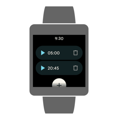
Google has successfully applied its new Material You theme to all of its major apps like Gmail, Google Photos, Play Store, and more. Now, the tech giant is shifting its focus to smaller platforms starting with Google Clock. The app is finally joining the Material You design club.
Make sure to visit: Specs Comparison: OnePlus Nord 2 vs Google Pixel 5a 5G
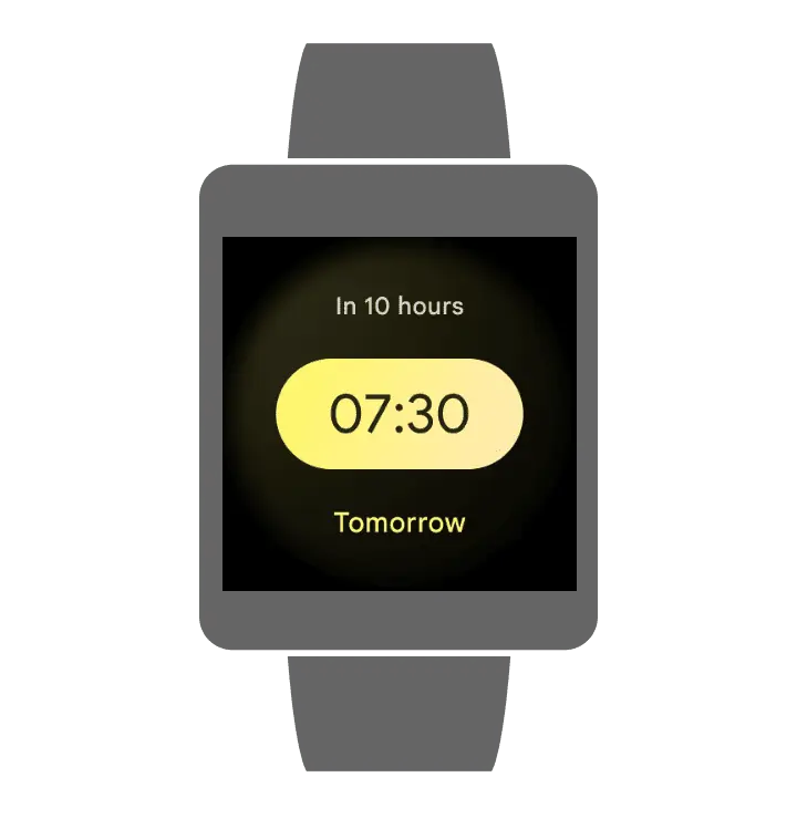
The Alarm tab under the Google Clock gained a title depth with the Material You makeover. Instead of the black and blue color scheme, the time is now displayed in a yellowish pill set at the center of the screen. Above it, you can see the time pending for the alarm to ring in a semi-opaque circle. Here’s a picture below for your reference.
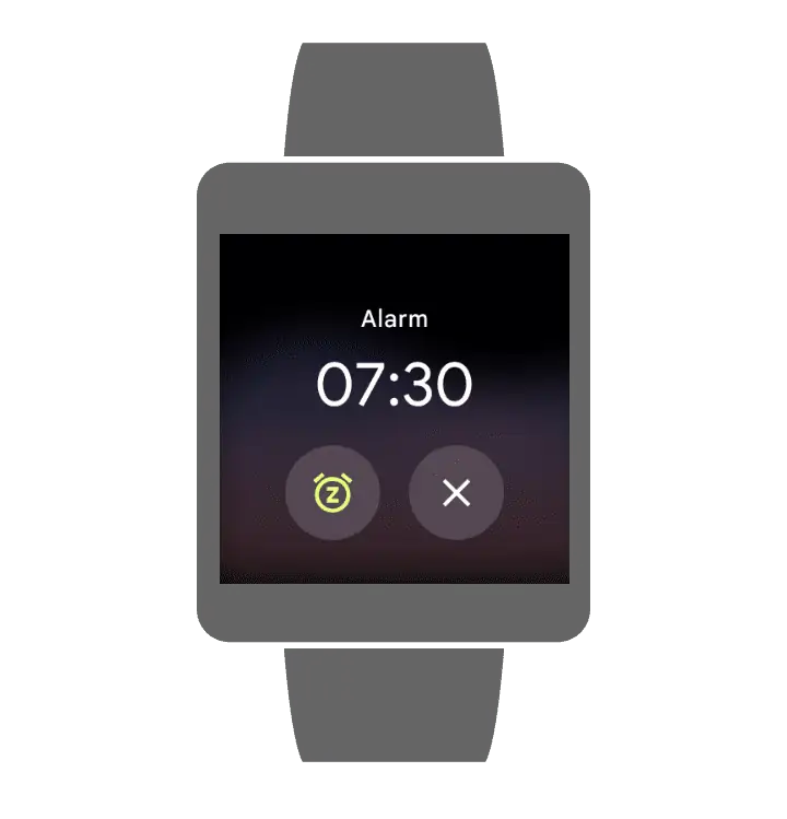
When the time is finally completed and the alarm rings, you can notice a blur two-tone texture in the background. The time along with snooze and dismiss options are shown on the screen as in the picture below.
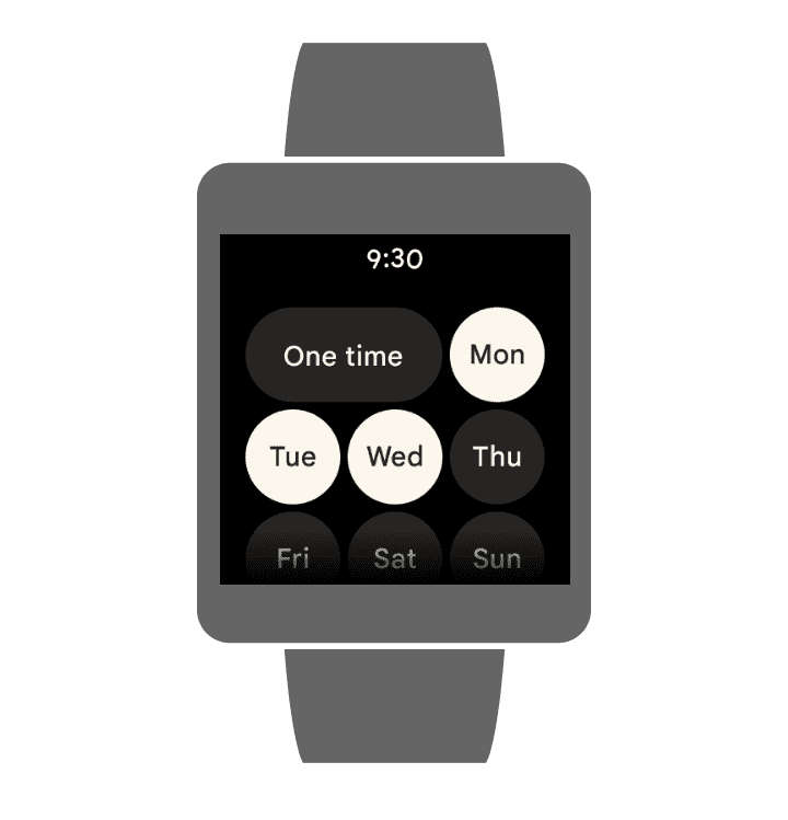
If you want to repeat the alarm, you will notice large and bubbly buttons for the purpose. These buttons also represent a slightly yellow tint, with no fancy background.
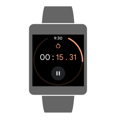
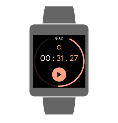
Talking about the stopwatch, it has a large circle of blue dots. The time, reset button and stop buttons are in the middle. The circle looks solid with a color change, again. This time, it is peach.


