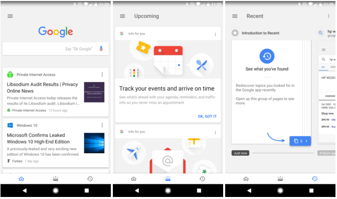
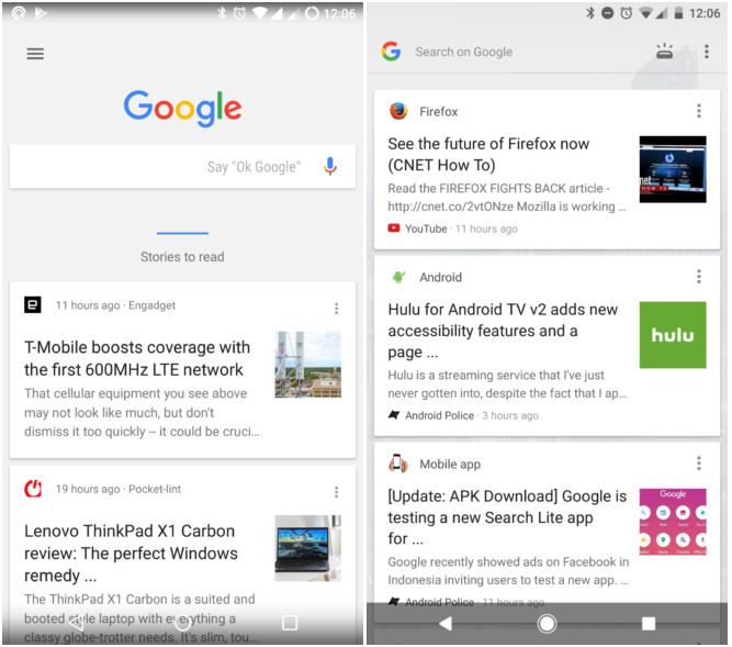
The Google app is reportedly getting the tabbed interface to more users. The new interface was ushered in as part of Google’s idea to get useful info to users quickly. For that, Google added two tabs at the bottom of the Google Search app. One tab led users to the feed. The other to reminders/emails/etc. A third “recent search” tab was also added later. These changes were limited to a few users. Now, the change is being seen by even more people.


Needless to say, Pixel Launcher will also see the change. When users open the Google Search app, they will now see three aforementioned tabs at the bottom. But Google has also made it harder to access those other tabs. Users will have to tap the new button on the top right that will take them to the Google app.

