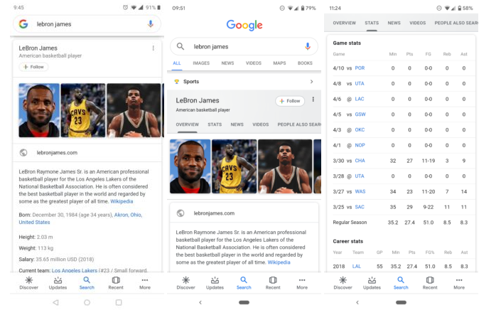
As always keeping its traditions to bring new features, Google rolled out a new and better interface for search card results. The latest Google update brings many changes – normal header color, a new Follow button with deep integration of Discover logo. Additional tabs for getting essential data is also present. After a month testing, the wider rollout took place in yesterday. The new search result card brings new elements full of additional Information.
The updated cards come with a new gradient pastel header rather than the old bold one. Colored tab titles, different font, and the tab section sign optimizations are also present. Also, the new follow Button is giving a full overhaul.
However, the story doesn’t end here as there are more changes in functionality. For the Google cards, the company seems to use all the details it can gather from reliable sources over the Internet and create more informational cards every time. Now you can access all the informational easily by using the latest tabs in Google cards. Instead of scrolling pages after pages for relevant information, you will get everything in a single place with the Google updates.
If these changes are visible to you, it’s great, having an older version of Google App doesn’t seem to obstruct these cards, however, if you don’t, you can still download the latest version from here: v9.66.5 at APK Mirror.

