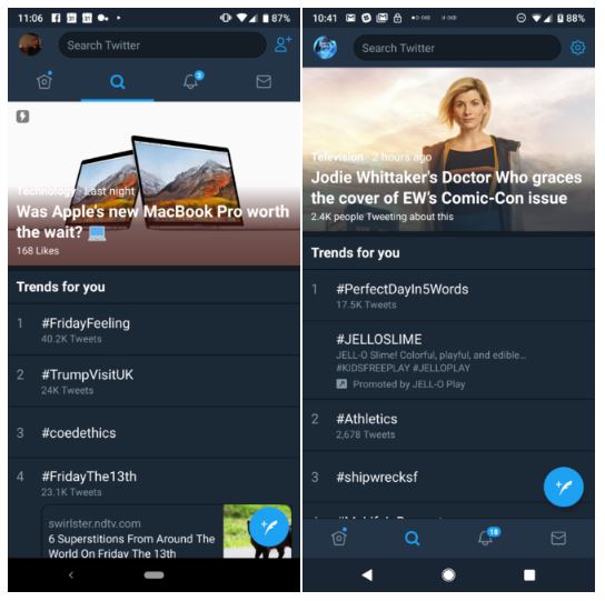
With the increasing size of smartphone displays, it is becoming typical to use the device. Even the app developers are tweaking their apps so that users can easily navigate through them. Today a well know social-media platform Twitter joined this league and released the bottom-placed navigation bar for your ease. Twitter keeps on updating their platform as per the latest market trend and this time as well a great change has been brought to the app.

Earlier in an app teardown, it was said that soon Twitter will gonna roll out a bottom-placed navigation bar. In the app breakdown, Twitter was found testing this feature and now officially on Twitter, they have announced that the testing period now comes to an end. The rollout of this new feature will start today and has already been reached to a number of devices. The bottom navigation bar change might appear subtle to most of you but in real time it does help a lot.

Now, your thumb can easily reach to the navigation bar in the Twitter app. Rather than top, it is now placed at the bottom. This Change can make your browsing quick and comfortable as there is no need to move your fingers towards the top of the smartphone’s screen. Along with this variation, some other tiny changes can be witnessed as well. The size of the search bar has been customized and on the top right, you can notice the settings icon instead of the regular contacts icon. This change is server side and doesn’t need an update to arrive.
