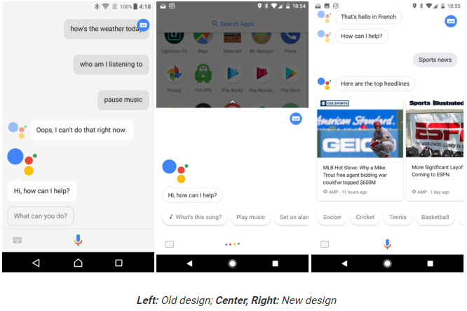
Google is now rolling out the rounded UI to its Assistant app on Android. You might have noticed those rounded corners in the search bar on your browser. Not only that, everything including card results, buttons and search bar elements all got the curves recently. I noticed the change on my browser just a week earlier. The change in UI is also for Chrome as well. so this means, we’re going to see a system-wide implementation of the new UI.
But with Assistant, there is one annoying change, I have to say. Earlier, there used to be a light grey background, now it is deep white. This does hurt the eyes somewhat. And it is not a very welcome visual change. The round UI is good, but we don’t favour the white backgrounds.
You might not notice the rounded captions at all because Assistant didn’t have a boxy rectangular UI anyway. So, the difference is minimal. However, we have some images here, if you want a clearer idea. Let us know what you think about the new rounded UI.

