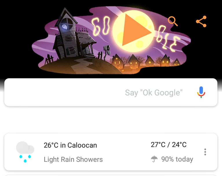
Earlier this month rumors said that Google was working on a redesign of the feed found in Google App. It looks like this redesign might introduce a new navigation bar and rounded UI objects. These design changes may not be appreciated by all but, it looks like Google is rolling them out.
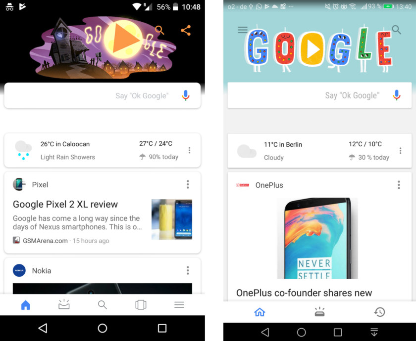
A Reddit user spotted the rollout of the new design, which came with version 7.15 of the Google App (others don’t have it yet, so it could be a server-side change.) They also uploaded a screenshot of the new interface, which is on the left, and the previous design can be seen on the right. It’s a nice looking update, rounded cards look playful, while the bottom navigation bar has also been redesigned and now it holds five icons instead of 3. The hamburger menu, previously found at the top left of the Google feed, is now towards the south.
We still find the “upcoming” icon to be unclear, though, it has changed from a brick that’s just had a bright idea to a shallow half-pipe that’s just had a bright idea. Further, it seems to be a bad idea having two identical search icons on the same page one at the bottom center and other at the top right of the screenshot on the left. We are sure that there will be a lot more changes to the Google Feed, which we’re going to see.
So are you the ones who liked the change or the ones who disliked it, do let us know in the comments below.


