After the Material Theme redesign and Dark mode feature, Google is presenting a major revamp to the Play Store menu and brings an overhaul to the Settings page.
Must see: Guide to install Android 12 Emojis on any Rooted Android Smartphone
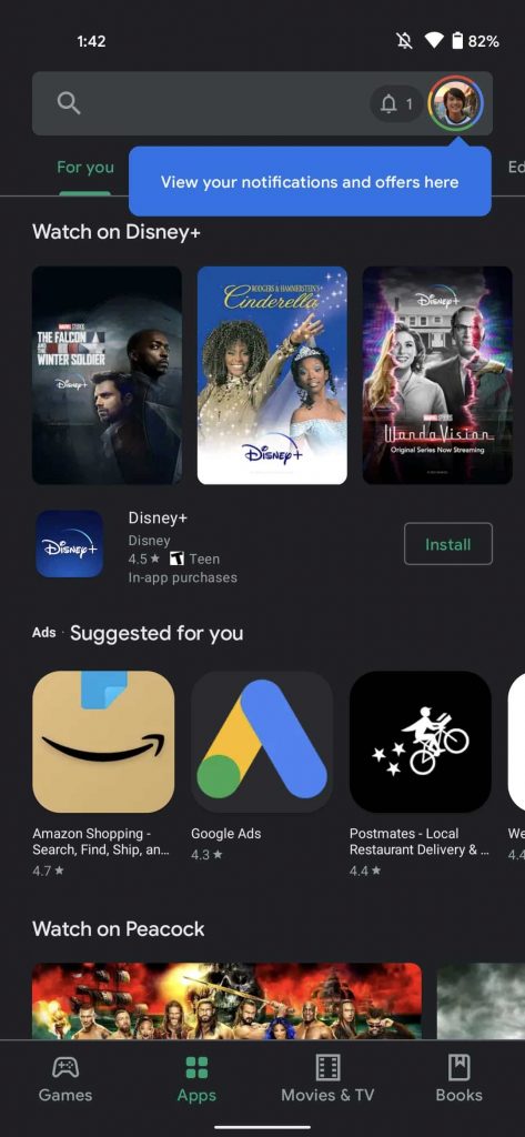
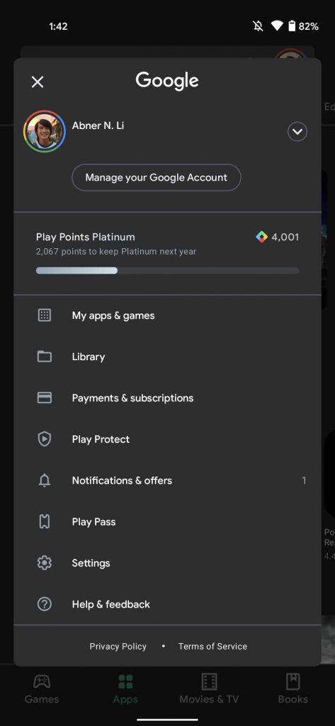
The updated Play Store does not display the hamburger menu at the top left corner anymore. In fact, a blue overlay appears at the top-right corner where you will find the menu and your profile highlight. In case you have multiple accounts logged in, they will remain hidden until you tap the expand icon. Below that will be your Play Points status with a progress bar. This is further followed by the rest of the menu.
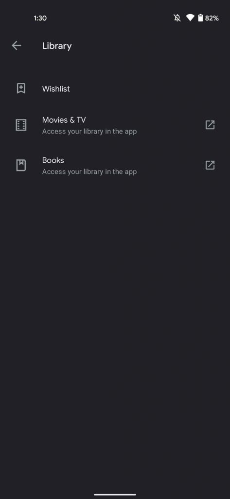
The “My apps & games” sections appear to be the same, but a new “Library” page is there which links to wishlist, Google TV/Play Movies & TV, and Play Books. Also, “Payments & subscriptions” have been combined to a single page, following that is “Play Protect”.
The “Notifications & offers,” and “Play Pass,” sections have moved down from the previous placements. An alert count will display your pending notifications when you first open the app. At last, comes the “Settings” page after the “Help & Feedback” section.
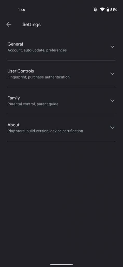
Moreover, the Settings page has become less of a mess. The long list of options is now categorized into four expandable sections that are hidden by default. The further segments are:
- General which shows Account, auto-update, and preferences
- User Controls gives control for Fingerprint and purchase authentication
- Family enable Parental control and parent guide
- About informs about Play Store, build version, device certification, and open source licenses.
The new design started appearing to some users for the past couple of months. But Goggle is pushing a wider roll-out now. The app will automatically get the update. Just in case, the new design doesn’t show up on the next install, head to the phone’s Settings -> Apps -> Google Play Store -> Force stop. This will revamp your app.
